This article was written solely for informational and educational purposes, and does not constitute medical advice. If you have any health concerns, please consult a qualified medical professional.
Randomised controlled trials (RCTs) are widely recognised as the gold standard of study designs, but they are not always possible to perform. For example, it would have been neither ethical nor feasible for Richard Doll and Austin Bradford Hill to randomly assign a group of volunteers to a smoking and non-smoking group in order to show that cigarettes cause lung cancer. However, they were still able to establish a link between smoking and the disease, using first a case-control study and then a prospective cohort study.
These are both types of observational study, an alternative to RCTs that can be very informative – as in the case of smoking and lung cancer. Unfortunately, the fact the participants are not randomised to different groups in observational studies can make their results particularly difficult to interpret. In this article, I will discuss how diagrams representing causal relationships can help us to spot potential sources of bias in these kinds of studies.
Causal Inference
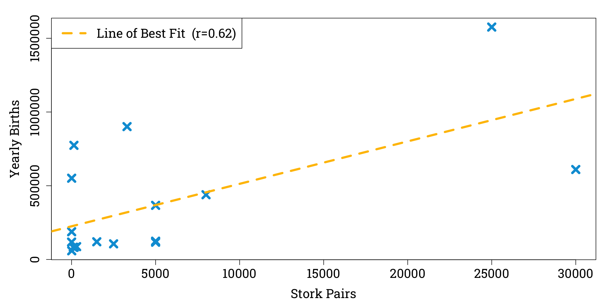
Causal relationships are notoriously difficult to distinguish from mere statistical associations, as summed up in the famous saying “correlation does not imply causation”. A humorous example of this can be found in an educational statistics paper in which the author investigates the fairy tale that storks deliver babies by analysing 1980s estimates of stork populations and birth rates in seventeen different European countries.
Estimates of European Stork Populations and Birth Rates in the 1980s
|
Country |
| Albania |
Austria |
Belgium |
Bulgaria |
Denmark |
France |
Germany |
Greece |
Holland |
Hungary |
Italy |
Poland |
Portugal |
Romania |
Spain |
Switzerland |
Turkey |
| Stork Pairs |
100 |
300 |
1 |
5000 |
9 |
140 |
3300 |
2500 |
4 |
5000 |
5 |
30,000 |
1500 |
5000 |
8000 |
150 |
25,000 |
| Yearly Births |
83,000 |
87,000 |
118,000 |
117,000 |
59,000 |
774,000 |
901,000 |
106,000 |
188,000 |
124,000 |
551,000 |
610,000 |
120,000 |
367,000 |
439,000 |
82,000 |
1,576,000 |
We can plot these data and observe a linear relationship between stork populations and birth rates, with a correlation coefficient of 0.62 to two significant figures.
Plotting the Data and Calculating the Correlation Coefficient in R
stork_pairs <- c(100, 300, 1, 5000, 9, 140, 3300, 2500, 4, 5000, 5, 30000, 1500, 5000, 8000, 150, 25000)
yearly_births <- c(83000, 87000, 118000, 117000, 59000, 774000, 901000, 106000, 188000, 124000, 551000, 610000, 120000, 367000, 439000, 82000, 1576000)
correlation <- cor(stork_pairs, yearly_births) # calculating the pearson correlation coefficient
par(mar=c(bottom=4.2, left=5.1, top=1.8, right=0.9), family="Roboto Slab") # setting the plot options
plot(stork_pairs, yearly_births, # plotting the data points
     xlab="Stork Pairs", ylab="Yearly Births",
     pch=4, cex=1.8, col="#009ed8", lwd=4.8, cex.lab=1.5, cex.axis=1.5)
abline(lm(yearly_births ~ stork_pairs), # adding the line of best fit
       col = "#ffc000", lty=2, lwd = 4.2)
legend("topleft", # adding a key
       legend=paste0("Line of Best Fit  (r=", round(correlation, 2), ")"),
       col="#ffc000", lty=2, lwd=4.2, cex=1.5)
Moreover, performing a significance test for correlation with the null hypothesis that there is no relationship between stork populations and birth rates gives us a p-value of less than 0.05, a common threshold for a result to be considered statistically significant.
Testing the Null Hypothesis in R
significance_test <- cor.test(stork_pairs, yearly_births)
p_val <- significance_test$p.value
cat("p-value:", p_val)
Clearly, more storks do not cause more babies to be born. But the non-causality of statistical associations might not always be so obvious. To deal with the challenges of understanding causes and effects, a new branch of statistics known as ‘causal inference’ has emerged over the past few decades.
This type of statistics often involves the use of directed acyclic graphs – ‘DAGs’ for short – to model the relationships between variables. Let’s explore the essential features of these diagrams.
Directed Acyclic Graphs
In discrete mathematics, a graph is a structure made up of vertices linked by edges. A path between two vertices is a sequence of edges linking them together.
For example, in the above graph, there is a path between A and C along the the sequence of edges between vertices A, B, D, E, and C.
Directed graphs are a particular type of graph in which all the edges are arrows. In these types of graph a vertex can be an descendant or ancestor of another vertex if there is a path of arrows all pointing in the same direction between them; the descendant lies at the arrowhead and ancestors lies at the tail. If this path is only one edge long, the ancestor can be called the descendant’s parent and the descendant can be called the parent’s child.
Here, B is a parent (and thus also an ancestor) of C and D, a child (and descendant) of A, and and ancestor of E.
Directed graphs are ideal for causal inference, because we can use vertices to represent the variables and edges to represent the causal relationships between them, with parents having a direct effect on their children. For example, a simplified DAG showing the effects of different factors on a person’s chance of developing lung cancer might show the variables ‘Genetics’, ‘Environmental Factors’, and ‘Smoking’ all to be parents of the variable ‘Lung Cancer Risk’.
An acyclic graph is simply one that contains no cycles (a cycle is a directed path leading from a variable back to itself), so when we use a DAG to model causal relationships a variable cannot cause itself.
An example of a DAG which might explain the correlation between the stork populations and birth rates of European countries could introduce extra variables, such as land area and human population size.

This DAG could account for the association between the ‘Stork Population’ and ‘Birth Rate’ variables without requiring there to be a causal relationship between them; their correlation can be explained by the fact that ‘Land Area’ is both a parent of ‘Stork Population’ and an ancestor of ‘Birth Rate’.
There are several structures that commonly appear appear in DAGs representing observational studies. In the rest of this article I want to focus on two of the most important – confounders and colliders – and explore how both of them can help to explain misleading results in medical research.
Confounders
When we are investigating the effect of a variable X on another variable Y using an observational study, one of the most common ways we can be misled is by confounding. This occurs when a third variable has an effect on both X and Y, which can lead to them being correlated even if there is not in fact a causal relationship between them. For instance, we could say that land area is a confounder when we are investigating the relationship between stork populations and birth rates, because an increase in land area leads to an increase in both variables. In a DAG, we can define a confounder to be a variable on a path between X and Y which is an ancestor of both of them.
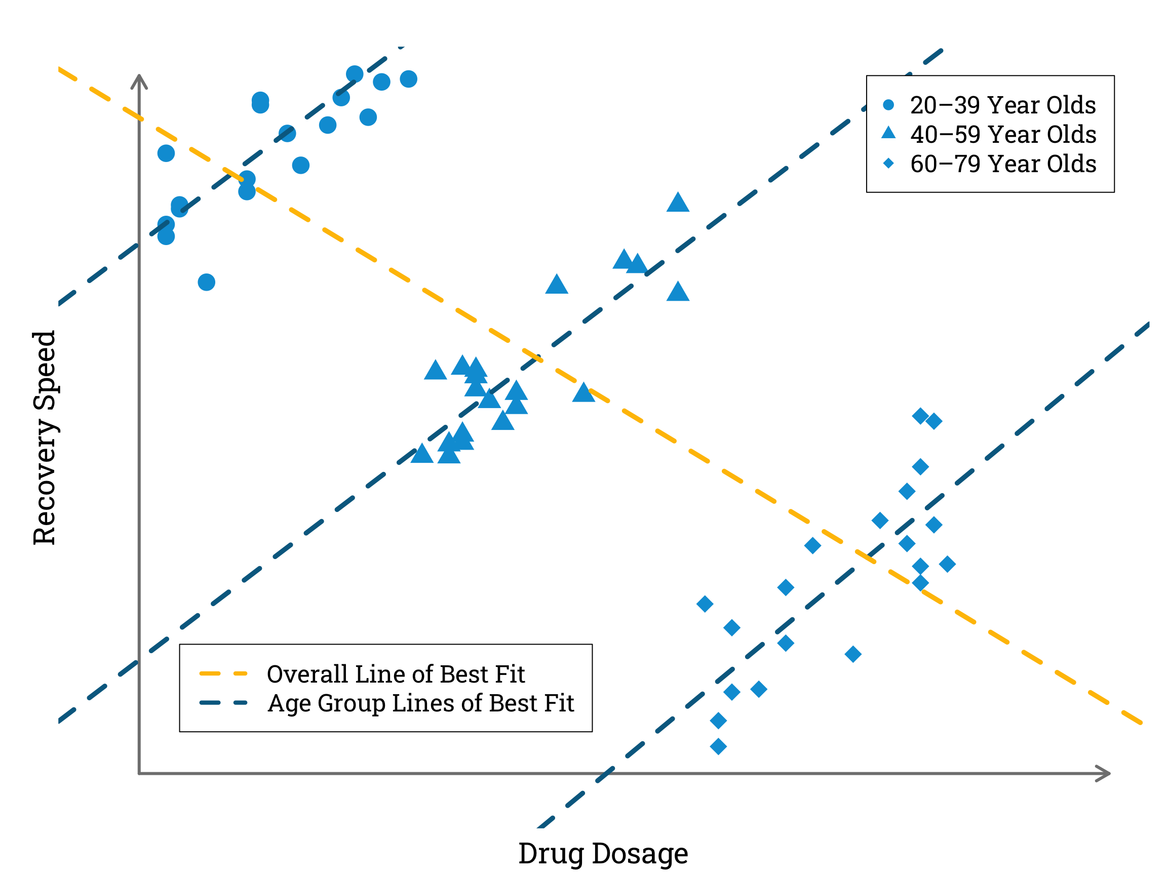
In the most extreme cases, confounding can actually mean that the true effect of X on Y is reversed, in a phenomenon known as Simpson’s paradox. Robert Heaton gives an helpful illustration of this in his blog post ‘Making peace with Simpson’s Paradox’. He asks us to imagine a hypothetical illness with a specific drug treatment that causes faster recovery in higher dosages. This would seem quite straightforward to prove by collecting data on the amount of treatment different patients were given and the time it took them to recover. Then, however, he complicates the scenario by introducing a third variable – age. If older people tend to recover more slowly, and also tend to require higher dosages of the treatment drug to recover at all, an observational study that does not control for age may actually end up showing a negative correlation between drug dosage and recovery speed.
Simulating and Plotting Data to Illustrate Robert Heaton’s Example of Simpson’s Paradox in R
set.seed(31415) # setting a seed so the simulated data is reproducible
group_1_dosages <- sample(1:20, 20, replace = TRUE) # simulating a range of dosages
                                                    # taken by 20-39 year olds
group_2_dosages <- sample(21:40, 20, replace = TRUE) # 40–59 year old dosages
group_3_dosages <- sample(41:60, 20, replace = TRUE) # 60–79 year old dosages
all_dosages <- c(group_1_dosages, # concatenating all the dosages
                 group_2_dosages,
                 group_3_dosages)
group_1_recovery_speeds <- 1.2 * group_1_dosages + 100 + rnorm(20,0,5) # simulating the recovery speeds of                                                                        # 20–39 year olds according to a
                                                                       # linear relationship with dosage
                                                                       # with independent gaussian errors
group_2_recovery_speeds <- 1.2 * group_2_dosages + 50 + rnorm(20,0,5) # 40–59 year old recovery speeds
group_3_recovery_speeds <- 1.2 * group_3_dosages + rnorm(20,0,5) # 60–79 year old recovery speeds
all_recovery_speeds <- c(group_1_recovery_speeds, # concatenating all the recovery speeds
                         group_2_recovery_speeds,
                         group_3_recovery_speeds)
par(mar=c(bottom=2.4, left=3, top=2.4, right=0.9), family="Roboto Slab") # setting the plot options
plot(group_1_dosages, group_1_recovery_speeds, # plotting the simulated data for 20-39 year olds
     xlim=c(-3,72), ylim=c(36,120),
     pch=16, cex=2.4,  col="#009ed8",
     bty="n",  axes = FALSE,)
points(group_2_dosages, group_2_recovery_speeds, # plotting the simulated data for 40-59 year olds
       pch=17, cex=2.4,  col="#009ed8")
points(group_3_dosages, group_3_recovery_speeds, # plotting the simulated data for 40-79 year olds
       pch=18, cex=2.4,  col="#009ed8")
arrows(x0=0, y0=39, x1=72, y1=39, length=0.15, code=2, lwd=3, col="#808080") # x-axis
arrows(x0=0, y0=39, x1=0, y1=120, length=0.15, code=2, lwd=3, col="#808080") # y-axis
mtext("Drug Dosage", side=1, line=1, cex=1.8) # x-axis label
mtext("Recovery Speed", side=2, line=0, cex=1.8) # y-axis label
abline(lm(group_1_recovery_speeds ~ group_1_dosages), # plotting the line of best fit for
                                                      # only the data from 20–39 year olds
       col="#006a90", lwd=4.8, lty=2)
abline(lm(group_2_recovery_speeds ~ group_2_dosages), # plotting the line of best fit for
                                                      # only the data from 40–59 year olds
       col="#006a90", lwd=4.8, lty=2)
abline(lm(group_3_recovery_speeds ~ group_3_dosages), # plotting the line of best fit for
                                                      # only the data from 60–79 year olds
       col="#006a90", lwd=4.8, lty=2)
abline(lm(all_recovery_speeds ~ all_dosages), # plotting the line of best fit for all the data
       col="#ffc000", lwd=4.8, lty=2)
legend(x=54, y=120, # adding a key for the data points
       legend=c("20–39 Year Olds ", "40–59 Year Olds ", "60–79 Year Olds "),
       pch=c(16, 17, 18), col="#009ed8", cex=1.5)
legend(x=3, y=54, # adding a key for the lines of best fit
       legend=c("Overall Line of Best Fit ", "Age Group Lines of Best Fit "), lty=2,
       col=c("#ffc000","#006a90"), lwd=4.2, cex=1.5)
In the simulated data plotted above, a higher dosage of the treatment drug corresponds with a faster recovery speed within each age category. However, when we combine data from all the age categories we find a negative correlation between drug dosage and recovery speed.
Finding the Correlation Coefficient in R
correlation <- cor(all_dosages, all_recovery_speeds) # calculating the pearson correlation coefficient
cat("Pearson Correlation Coefficient:", correlation)
Pearson Correlation Coefficient: -0.7453944
When we draw the DAG for this example, we can see that the variable ‘Age’ is acting as a counfounder, obscuring the true causal relationship between the ‘Drug Dosage’ and ‘Recovery Speed’ variables.
Simpson’s paradox has been observed several times in the medical literature, perhaps most famously in a 1986 observational study by a group of urologists on the effectiveness of different types of procedure for the removal of kidney stones. Wisely, the researchers recognised that stone size might be a confounding factor, so they split their data according to whether the original stone was less than two centimetres in diameter or not.
Observed Success Rate of Kidney Stone Removal Procedures
|
Success Rate |
| Open Surgery |
Percutaneous Nephrolithotomy |
| Stone Size |
Small |
≈ 93% \(\left( \frac{81}{87} \right)\) |
≈ 87% \(\left( \frac{234}{270} \right)\) |
| Large |
≈ 73% \(\left( \frac{192}{263} \right)\) |
≈ 69% \(\left( \frac{55}{80} \right)\) |
| Both |
≈ 78% \(\left( \frac{273}{350} \right)\) |
≈ 83% \(\left( \frac{289}{350} \right)\) |
The urologists found that open surgery had been more successful than percutaneous nephrolithotomy in both small and large stones. But if they had not stratified their data by stone size, they would have obtained a higher overall success rate for percutaneous nephrolithotomy than for open surgery. The reason for this was that patients with small stones were more likely to be treated with percutaneous nephrolithotomy than patients with larger stones, and these were also the patients most likely to have a good result regardless of the procedure they underwent. So stone size influenced both the choice of treatment and the treatment outcome, and thus acted as a counfounder.
The size of a patient’s stone might have influenced their probability of having one treatment over another for any number of reasons. For instance, perhaps patients with smaller stones were more inclined to be concerned about the side effects of open surgery, or perhaps there was a longer waiting list for percutaneous nephrolithotomy that patients with larger stones tend to be less willing to tolerate. (These are just examples of possible explanations, not necessarily the true reasons that the size of kidney stones affected doctors and patients’ choice of treatment in the 1986 study.)
Colliders
Another issue that can arise in observational studies is collider bias. When we are investigating the effect of X on Y, a collider is a variable lying on a path between X and Y where two causal arrows meet, meaning the collider has more than one parent.
 In observational medical studies, it is not uncommon that the variables we are investigating, X and Y, both have a causal effect on the probability that a patient is included in the study. In these cases, selection into the study is itself a collider variable.
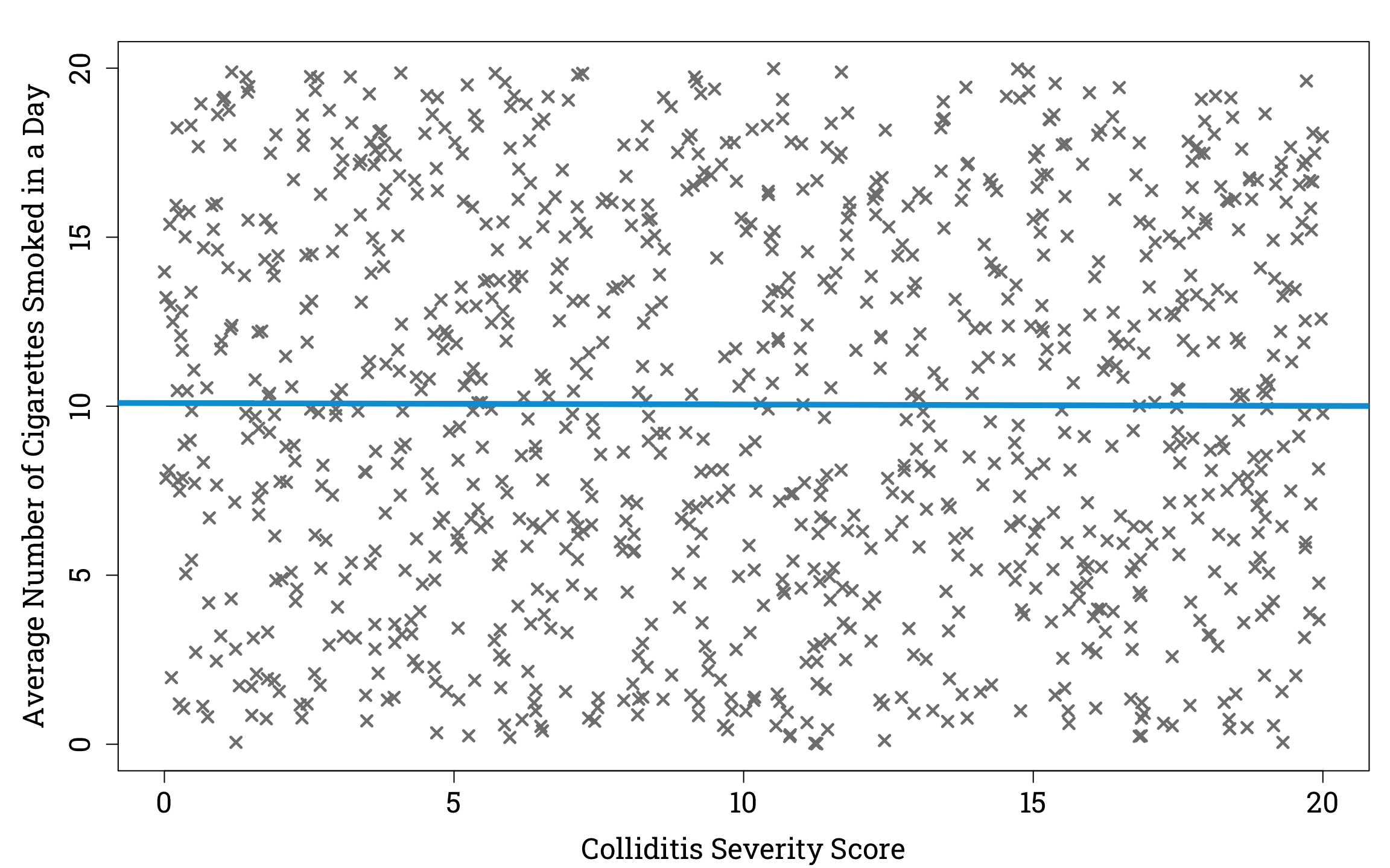
To understand how collider bias can cause unrelated variables to appear to have a correlation, let’s imagine a hypothetical virus called ‘colliditis’. We’ll supose that the severity of disease experienced by people who catch colliditis is unrelated to the number of cigarettes they smoke in a day. For simplicity, we can assume that the average number of cigarettes of smoked a day and the severity of disease are uniformly distributed in the population of people who have caught colliditis. So if we plotted a random sample of one thousand people from the population of people with the viral infection, it would look like this.
Plotting the Relationship Between Disease Severity and Average Number of Cigarettes Smoked in a Day in a Simulated Sample of People Infected With Colliditis in R
set.seed(31415)
n <- 1000
infected_sample <- matrix(0, nrow=n, ncol=2) # initialising an empty matrix to store the data for each person
for (i in 1:n) {
  severity <- runif(1, min=0, max=20) # assigning each person in the sample a random severity score between 0 and 20
  cigarettes <- runif(1,0,20) # assigning each person in the sample a random average number of cigarettes smoked per day between 0 and 20
  infected_sample[i,1] <- severity
  infected_sample[i,2] <- cigarettes
}
par(mar=c(bottom=4.2, left=5.1, top=1.8, right=0.9), family="Roboto Slab")
plot(infected_sample[,1], infected_sample[,2], pch=4, cex=1.2, lwd=2.4, col="#808080",
     xlab="Colliditis Severity Score", ylab="Average Number of Cigarettes Smoked in a Day",
     cex.lab=1.5, cex.axis=1.5)
abline(lm(infected_sample[,1] ~ infected_sample[,2]), lwd=4.8, col="#009ed8",) # plotting the line of best fit
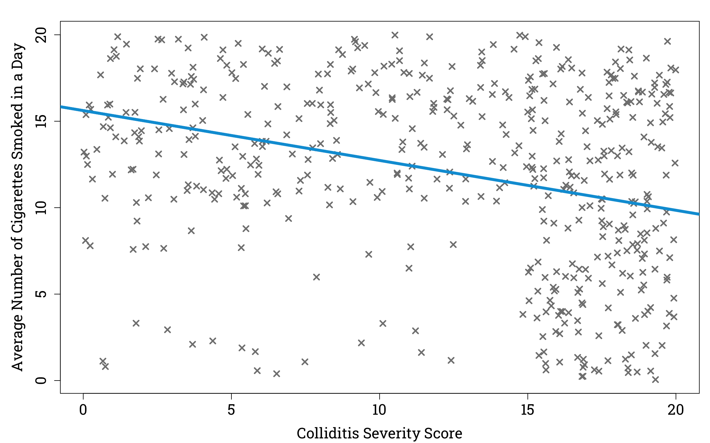
Now suppose that out of this sample, 90% the people with a colliditis severity score ≥15 are in hospital, and of those with a colliditis severity score <15, those who smoke ≥10 cigarettes a day on average have a 60% chance of being in hospital, compared to a 10% chance for those who smoke <10 cigarettes a day on average. If we plot cigarettes vs colliditis severity of only those in our sample who are hospitalised, we see an interesting result.
Plotting the Relationship Between Disease Severity and Average Number of Cigarettes Smoked in a Day in a Simulated Sample of Hospitalised People Infected With Colliditis in R
set.seed(31415)
hospital_infected_sample <- matrix(rep(NA, 2*n), nrow=n, ncol=2)
for (i in 1:n) {
  dice_roll <- runif(1, min=0, max=1) # generating random number between 0 and 1
  person_i <- infected_sample[i,]
  if(person_i[1] >= 15 && dice_roll <= 0.9) { # these people have a 90% chance of being in hospital
    hospital_infected_sample[i,] <- person_i
  } else if(person_i[2] >= 10 && dice_roll <= 0.6) { # these people have a 60% chance of being in hospital
    hospital_infected_sample[i,] <- person_i
  } else if(person_i[2] < 10 && dice_roll <= 0.1) { # others have a 10% chance of being in hospital
    hospital_infected_sample[i,] <- person_i
  }
}
# Now we remove the people not in hospital from our sample:
hospital_infected_sample <- na.omit(hospital_infected_sample)
# And plot the result:
par(mar=c(bottom=4.2, left=5.1, top=1.8, right=0.9), family="Roboto Slab")
plot(hospital_infected_sample[,1], hospital_infected_sample[,2], pch=4, cex=1.2, lwd=2.4, col="#808080",
     xlab="Colliditis Severity Score", ylab="Average Number of Cigarettes Smoked in a Day",
     cex.lab=1.5, cex.axis=1.5)
abline(lm(hospital_infected_sample[,1] ~ hospital_infected_sample[,2]), lwd=4.8, col="#009ed8",) # plotting the line of best fit
If we took the hospitalised population as representative of the general population we would find that there is a negative relationship between average number of cigarettes smoked in a day and severity of colliditis. But we would be failing to account for the fact that having a severe case of colliditis, and smoking a large number of cigarettes per day are both factors that make you more likely to be in hospital. So if you are in hospital with a low colliditis score, you are more likely to smoke a lot of cigarettes than if you are in hospital with a high colliditis score, since there must be some other reason for your hospitalisation than colliditis, and this reason may be smoking.
The DAG for this example would show that ‘Hospitalisation’ is a collider, and that there is no true causal relationship between the variables ‘Smoking’ and ‘Severity’.
For an example of collider bias in the medical literature, let’s turn to a case-control study of hospital patients with and without pancreatic cancer published in 1981, which found a strong association between patients’ coffee consumption and their likelihood of having developed pancreatic cancer.
Observed Coffee Consumption in Patients With and Without Pancreatic Cancer
|
Coffee Consumption |
Pecentage That Drink
O Cups Per Day
|
Pecentage That Drink
1 or 2 Cups Per Day
|
Pecentage That Drink
3+ Cups Per Day
|
| Diagnosis |
Pancreatic Cancer |
≈ 5% \(\left( \frac{20}{367} \right)\) |
≈ 42% \(\left( \frac{153}{367} \right)\) |
≈ 53% \(\left( \frac{194}{367} \right)\) |
Not Pancreatic
Cancer
|
≈ 14% \(\left( \frac{88}{643} \right)\) |
≈ 42% \(\left( \frac{271}{643} \right)\) |
≈ 44% \(\left( \frac{284}{643} \right)\) |
In the decades since this study was published, several large prospective cohort studies have found no significant relationship between coffee consumption and pancreatic cancer risk , suggesting that the original study may have had a flaw in its design. What could it have been?
In his seminal epidemiology textbook, Leon Gordis points out the control group for this study – patients without pancreatic cancer – was chosen in an unusual way. When a patient who did have pancreatic cancer agreed to answer a survey about their dietary habits, control patients were selected by asking the doctor responsible for their care to identify other patients of theirs without the condition. Since these doctors were often gastroenterologists, patients with gastrointestinal disorders were over-represented in the control group. These patients tended to drink less coffee than the average member of the population, either because it exacerbated their symptoms or because they had been advised to cut down their intake by their doctors.
As a result of the atypical coffee consumption in the control group, the results of this observational study are hard to interpret. This is because even if it was the case that there was no causal relationship between coffee consumption and pancreatic cancer, we would still expect to see an association between them due to the fact that people with GI disorders were more likely to be chosen as controls than other patients. We can show this in a DAG in which ‘Selection into Study’ is a collider.